What 2020 campaign style can tell us about the modern look of making change.
We’ve written about political campaigns and their design sensibilities before: Read David Waid’s “A Journey Through Presidential Branding” here.
Twelve years ago marked a pivotal shift in campaign colors palettes. What was the shift? Hope.
Not the feeling, but an image.

Shepard Fairey. Barack Obama “Hope” Poster. 2008. National Portrait Gallery, Smithsonian Institution

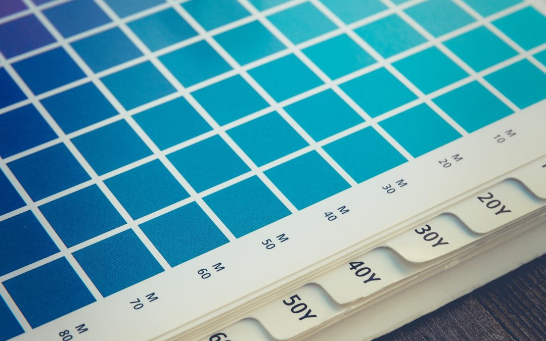
Obama “Hope” Poster color palette
The Obama HOPE poster, designed by famed American Contemporary artist Shepard Fairey, became the major turning point for campaign color palettes in the United States. Now ubiquitous in pop culture, the piece has been parodied into images of everyone from Admiral Akbar to Pope Francis.
But why?
The piece, with its graphically bold and heavily stylized aesthetic, uses five main colors that flirt with traditional stars-and-stripes patriotism, but hint at a more progressive sentiment with less conventional variations of the red, white, and blue.
While the “Hope” poster wasn’t Obama’s official campaign poster, it became a dominant symbol of his presidential campaign. Other Democratic campaigns at the time relied heavily on traditional red, white and blue color palettes to emphasize a sense of Americana – while this was the standard for a reason, it wasn’t a particularly innovative look.

2008 Hillary for President logo

Hillary for President color palette
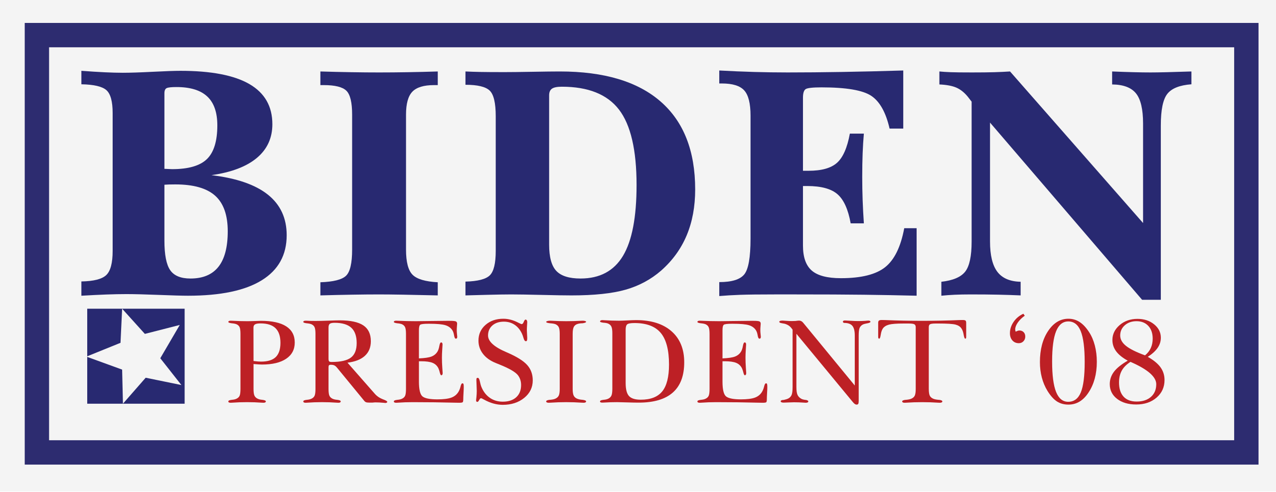
2008 Biden for President logo

Biden for President color palette
While the other 2008 Democratic campaign logos felt stuffy and representative of the past, the Hope poster sprinted ahead and established a new paradigm, where Americana wasn’t defined by a three-color spectrum.
With a new path paved for vibrant campaign posters, graphics, and logos, we’re starting to see even funkier color palettes enter the arena.
Kyrsten Sinema
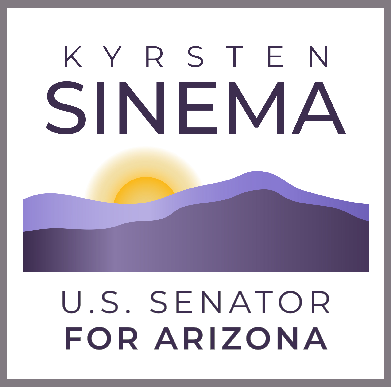
2020 Senatorial Logo – Kyrsten Sinema, sinema.senate.gov

Sinema color palette
This logo, which doesn’t use red, white, blue, or the Arizona state colors, instead references the hues of the Arizona landscape. The palette feels regal and refined in part due to the two purple tones. Purple has been historically associated with royalty due to the rarity and high cost of purple dyes.
Amy Klobuchar
![]()
2020 Amy for America Logo

Amy for America color palette
This campaign palette feels fresh. The green and blue cool tones conjure feelings of nature with green trees and open blue skies; reminiscent of Klobuchar’s home state of Minnesota Perhaps this is an attempt to attract younger voters, or maybe it just indicates a fresh start. Either way, it’s an intentional move away from traditional palettes.
Alexandria Ocasio-Cortez
![]()
Alexandria Ocasio-Cortez for Congress logo package, Tandem Design, 2018

Alexandria Ocasio-Cortez for Congress color palette
AOC’s 2018 campaign’s visual identity is a personal favorite. This palette offers another bipartisan, if not regal purple – but in a variety of shades, along with a bright, fresh blue and an electric yellow. It’s a rejection of the status quo and brings to mind pop art and youth – appropriate for the candidate it represents.
Lessons for modern change-focused work
What does it all mean? If we’ve learned anything from the past few years, it’s that the American political landscape is opening up. We’re seeing more young people, women, and people of color elected than ever before. It only makes sense that these fresh perspectives would bring with them fresh design sensibilities.
When we see a campaign’s visual identity break the rules, it’s meant to tell us something about them, just like red, white, and blue is meant to tell us something. It’s all purposeful, meaningful, and tied to the core of what the campaign is all about.
That’s not unique to politics either: imagine an accounting firm that dealt in hot pinks and baby blues, or an airline that avoided red and blue. When you consider your brand’s visual identity, remember that breaking the visual mold tells your story, as does sticking to classic sensibilities. At Javelina, we know that considering the full gamut of possibilities helps brands find a visual identity that accurately reflects who they are; sometimes, the offbeat ideas turn out to be the most effective.
Like an industry-leading consulting firm that’s not scared of bright orange.

Javelina Blog Author